50 Top Tips To Increase Your Ecommerce Website Conversion
Convert more of your traffic into sales without having to spend a lot of money

You can convert more of your traffic into sales without having to spend a lot of money. There are hundreds of ways to improve your conversion rate of your website, many of which can be done very quickly and most will cost you close to nothing to implement.
I’ve summarised 50 top tips for you below….
1. Use real customer testimonials with authentic customer photos rather than using stock photography because most shoppers will be able to identify the genuine from the false very quickly.
2. Make sure your marketing effort attracts qualified traffic. Don’t advertise something you can’t supply just to attract more traffic. This tactic may drive more visitors, but they are visitors with no intent to purchase, thus decreasing your conversion rate.
3. Get a free to call number and make sure the placement of that number on your site is prominent and consistent.
4. Include "points of reassurance" at every "point of action". For example - if you request that a customer provide you with their e-mail address, clearly state that privacy is very important to you and that you will not share that information with any other party.
5. Use SSL (secure server certificates from a well-known SSL authority) and make sure that the user knows you are using it. Display a prominent "Secure server" note at the top of the page.
6. Build trust, subscribe to a service like VeriSign, Thawte or ScanAlert and Prominently place these logos to reassure your customer that you care about the security of their information.
7. Have a clearly defined privacy policy and link to it from all pages.
8. Include a physical address on your site. This helps customers to believe you are a real seller!
9. Don't always concentrate on just making the "buy now" buttons the most prominent on every page, but rather concentrate on styling the "primary action" buttons the most prominently on every page. For example, if you sell books and provide the ability to select a few related books and compare them before they can buy now, then make that "compare” button/link the same style as you would the "buy now" button/link on a page in which the "buy now" button exists. This will help herd customers through your sales funnel.
10. Clearly Define your return policy for peace of mind.
11. Make sure to include an "About Us" section on your site. The majority of customers will visit or look for that section before making a purchase to reassure them about their purchase.
12. Make your site load fast, easy to navigate and user friendly. No need for horizontal scrolling, excessive vertical scrolling, large animation files or intrusive pop-up windows.
13. Keep your "buy now" button consistently and prominently placed on all product pages. The closer to the top of the page the better. "Above the fold if you want it sold" & "Eye level is buy level".
14. Provide clear good quality images of your products with an "enlarge image" option.
15. Make your checkout process as usable, intuitive, reassuring and simple as possible. Losing a shopper during your checkout process is a CRITICAL loss.
16. Don't make people type their e-mail address twice. Get the site to remember and do it automatically.
17. Don't force people to install crazy plug-ins just to make a purchase from your site. Stick with the usual and well-known ones such as JavaScript, Flash etc.
18. Read your site in full before publishing, make sure its compelling, yet not exaggerated and too loud.
19. Identify your unique selling proposition and exploit it. If you are the only seller of something in the UK, clearly state that and be proud of it.
20. Make sure you have a "site search" box and make sure it’s accurate. Not only it will allow users to find what they want quick, it will also allow you to gain insight as to what they are shopping for and what terminology (keywords/key phrases) they are using so you can tailor your copy (and ad campaigns) accordingly.
21. Don't just focus on lots of features of your product, but focus on the benefits those features will provide your customers with. For example, don't just say "folding chairs", say "Our folding chairs will save you valuable storage space without compromising comfort".
22. Display your prices, shipping charges and tax clearly BEFORE the checkout process is completed. Nothing is worse than getting a price in mind, then finding that you have more to pay at the end.
23. Don't use a drop-down for the "Country" or "County" list on your order form. Many people are using scrolling mice these days, so may accidentally scroll off of their correct address.
24. Let customers copy their shipping info to their billing info if they are identical, with one click – this will add to their experience rather than detracting from it.
25. Remove distractions as much as possible from the final checkout process such as the main navigation that existed during the shopping portion of your site. Keep this section simple.
26. Clearly provide a checkout process indicator. If your checkout process has 3 steps, clearly indicate at the top of the page what step they are on and how many steps there are to complete the order.
27. Clearly identify what information you really require during your checkout process. Eliminate unnecessary text fields/questions.
28. Use easy to understand, friendly error messages rather than “abrupt” messages. No "INCORRECT USER INPUT IN STATE FIELD!" messages.
29. If your checkout error messages occur on a page other than the page with the errors, preserve the information that the user has already input and get the site to input it automatically otherwise you will potentially lose customers when they’re ready to buy from you.
30. Double check the spelling on your site again and again before publishing it – and get bsomeone else to do it as well, as you can become blinded to them after a while. Errors on your website can make it look very unprofessional.
31. Try and get good reviews from shopping authority sites (shopping.com, epinions.com, bizrate.com, etc) and from previous shoppers. Testimonials can increase sales!
32. Don't use complex algorithms for shipping price calculations, like - 'if you buy 13.5 kilograms worth of x, then multiply that weight by y shipping rate”. Get the site to do the calculations and show the shopper the price.
33. Consider shipping the product free. This is often a great selling point with online shoppers. It could be worthwhile increasing the unit price to accommodate the costs as we all know there’s a cost involved in shipping, it’s just that shoppers often don’t like visibility.
34. Display the stock status of the selected item and do so BEFORE the user puts the item in their cart.
35. If you don't sell or have run out of or discontinued an item, remove it from the site immediately.
36. If you are offering a lot of products, users should be able to sort them by important criteria...price, size, colour, etc. so make sure this is possible on your site.
37. Provide an easy way for shoppers to compare details of similar products.
38. Use a custom 404 not found page to link people back to the important areas of your site.
39. Give a clear estimate of the delivery time.
40. Accept a wide variety of payment options and clearly display those options.
41. Important information should not look like ad banners. There really is such a thing as "ad blindness" and people will automatically skip over this important information.
42. Make sure you have a "first-time visitor" page. This is where you are going to explain why and how you are different from your competitors.
43. Update your copyright statements on page footers. Make sure that the current year is displayed, again it can make the business look very unprofessional to have outdated infomation.
44. Let customers make a purchase from you without having to register with your site.
45. Consider making every link the last part of the statement "I want to...". Don't just have a link that says "the privacy policy", but rather "read the privacy policy". Do you get it... the shopper wants to "Read the Privacy Policy".
46. Don't use too clever names for your shopping cart like "widget basket" or "widget box". Call it "My shopping cart" or "My shopping basket".
47. Don't ask the potential customer to select an option when there is only 1 "option". If the product only comes in red, don't make them select the "red" option or choose "red" from a drop down, make sure the site does it automatically.
48. Provide clear shopping instructions in an empty shopping cart. Don't just say "your shopping cart is empty", explain how to add an item to the cart.
49. Provide a "special sale" or "special clearance" section. This will attract the budget-conscious shoppers.
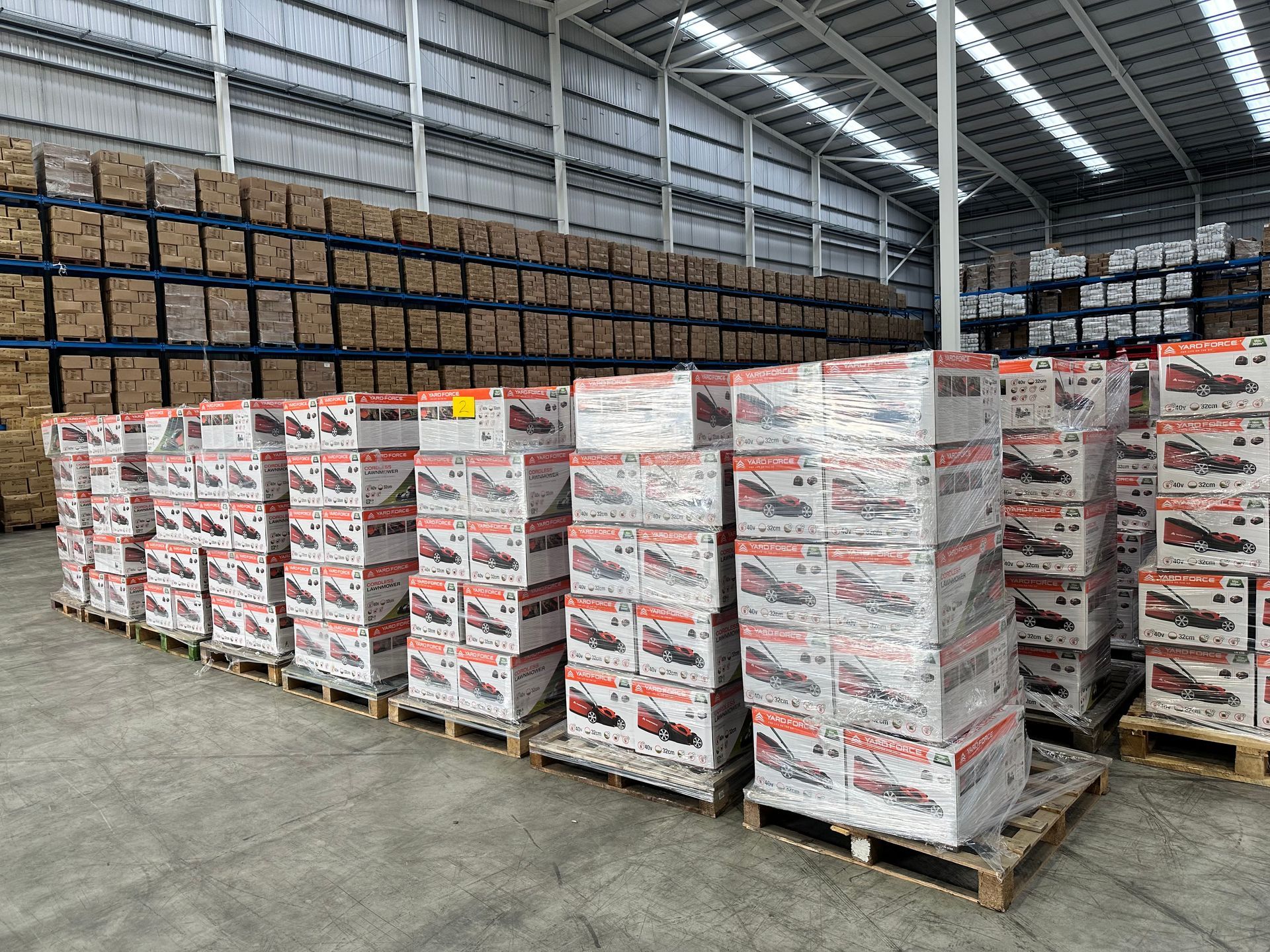
50. The most important golden rule... you must portray a lot of trust and credibility to instil shopper confidence and get them to make a purchase. Make sure you do. For example telling your shopper that you use a reliable fulfilment center for dispatching the orders can go miles in building that additional confidence for purchasing from your ecommerce website. Check Out Curo Fulfilment - our fulfilment center that has easily accessible links to M1 & M62 corridors ensuring your item reaches anywhere across the UK in promised timeline.

Author
Martin Doyle,
Operations Director,
Curo Fulfilment
Share